Samlip BI
Introducing the BI that reflects Samlip's history and management philosophy
Scroll up/down and take a closer look!
A red bowl holding the future, Samlip's vision
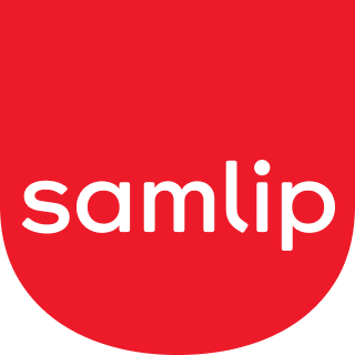
The BI of Samlip combines a traditional red shield symbol with the lowercase 'samlip' logo. The soft bowl shape and warm curves, representing 80 years of craftsmanship, convey challenges and a youthful sensibility to the global market.
Red Bowl
The red shield symbol in the BI of Samlip represents a bowl embodying over 80 years of craftsmanship and a warm heart. Gentle curves and ample white space convey the warmth and happiness that the brand seeks.
Typography 'samlip'
'samlip' in all lowercase and a sans serif font with emphasized curves, conveys a youthful and friendly feel. It conveys challenges and a modern sensibility to the global market, harmonizing with the curves of the symbol.
Color
It inherits the traditional red color, with a warmer tone to represent passion and vitality. The single color maintains brand consistency and harmonizes with the soft bowl shape to showcase simultaneously Samlip's heritage and future-oriented image.

Use Chinese and Korean characters for ellipses

Combination of S (samlip), F (food), 立 (三立), O (bread)

Two overlapping hearts symbolizing the hearts of consumers and the company

Showcasing a modern global image and a general food company


Demonstrating trust with customers and a willingness to change and innovate

Harmony (harmony, unity)

A willingness to step up as a general food company