


SPC Samlip BI
The concept of “Beyond Bakery” contains SPC Samlip’s will to grow as a comprehensive food company.
The tradition and craftsmanship we have accumulated over the last 70 years continue to uphold the values of youth and innovation, friendliness and happiness, and future-oriented lifestyles and sharing.

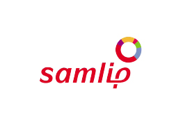
Symbol Mark
In addition to inheriting the traditional red color, the mark adds a soft and warm feeling by utilizing the unique curves and space throughout the logo as well as the style of handwriting.
Slogan
We express pride in making only the best products and promises to our customers. Our slogan contains our will to enter the global market.
History of Changes to Our BI
History of Changes to SPC Samlip BI
-
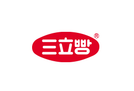 Chinese characters and Korean characters are used for the oval shape
-
 Combination of S (Samlip), F (Food), 立 (三立 = Samlip), and O (Bread Shape)
-

1980.06.01 ~
Two hearts overlapped to symbolize the hearts of consumers and businesses -

1995.01 ~
Modern and global image of a comprehensive food company -

1997.03.14 ~
-
2005.07 ~
Emphasis on trust and change with customers and the will to innovate -

2013.10 ~
“Harmony (Balance)” -
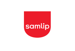
2017.09 ~
Willingness to take the leap as a comprehensive food company
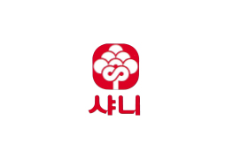
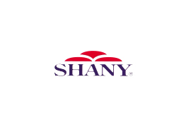
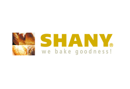
History of Change to Shany BI
-
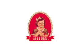
1972.10 ~
Symbol of high quality cake “Shany Cake” -
1983.09 ~
Shany Tree -
1994.05 ~
Image of a sun rising as an image of bread -
2000.05 ~
Currently, “We Bake Goodness”